Late, but only sorta sorry is this month's Sunday covers! Hah by now most of these are out, but maybe seeing these here will help people decide on what they'd like to buy?

First off is Birdmen's 11th volume! This is pretty straightforward --as most covers featuring a single character rather than a scene or something else are, but Tanabe's use of color --or lack of it really makes it pop! I also really like the logo for the series --it's just as visually striking as Barbara here --who has a great design as well.

A volume away from 40 is Rinne! Takahashi is one who has very distinct character designs as well and I think that shows here in this cover. Her name being in pink actually lends a sense of visual unity as well as symmetry with the logo and volume #. Interesting that Rinne himself isn't on the cover though --in fact Sakura isn't either. I'm curious as to what chapters this volume covers as I'm sure I talked about some of them and it might explain why the main characters aren't here. Other than that, I think Takahashi does do a good job of distinguishing her characters even if they do look a little samey.

Volume 2 of Reach Ishyama's horror manga is pretty tame when compared to the first. While it's not like the first volume with Chihiro on it screamed "Oh the horror manga!" it at least had a strong impact visually. Sadly this one doesn't as much, but what it does have is a wonderful sense of color and composition. I think as I write about covers I'm finding that I prefer ones like this that are scenes out of the manga rather than being a character striking a pose or a group lineup. Ishiyama has managed to do both here though, and pulled it off wonderfully.

Speaking of ensemble covers, Magi bids farewell with one of all the major characters in the series all together in a group photo. Interesting choice for a final volume though not particularly novel --not that there's anything wrong with this! We're saying goodbye to these characters after all, so it's nice to see all of them in the same place. There's a lot of energy in the layout and I really like that Ohtaka nails the volume # placement right there in the middle at a modest size. We'll miss you Aladdin --you and all of your friends.

Ahh Wakaki, I really wish you'd tackle things I'm interested in because your art is so cute, this cover being no exception. I feel like I might have seen this somewhere before --probably an advertisement for the release I suppose. It might have been nice for the whole cover to have the blue boxes at the bottom cover the whole thing if I'm to be honest, but other than that minor quibble, this is an excellent cover with a wonderful use of color. (I just wish I had more interest in idols...)

Holy wow, I didn't realize Be Blues was at 29 volumes. It makes the fact that it has no anime all that much more baffling really. Is the series really going to go it's entire career without one...in any case, it's a simple cover with no frills --you gotta get in there to see Tanaka's wonderful artwork yourself. That being said, I do wish the blue (hurrr) strip weren't obscurring the artwork. I feel like a clean version of this would make for a wonderful poster. Maybe I should track down Tanaka's twitter and see if he offers clean versions like Fukuchi does? Speaking of which..
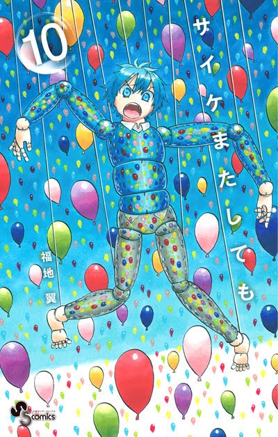
Not quite up there with the masterwork that was volume 9, but still really good in it's own right is Saike (Psych's?) 10th volume. I'm waiting for the digital release to start properly translating this, but maybe if people want it I can talk about the volume extras (if applicable?) here? Just hit me up in the comments if you're interested in that sort of thing. That being said, I do sort of which I could get my hands on a physical copy cause I'm sure the colors are more vibrant in person! The reference to the villain's oracle in this volume is also a neat touch so it doesn't feel like a random "just because" sort of thing. I like that Fukuchi even takes a bow out and has his name very small on the side --this is volume 10, so you should know who he is by now, so allowing the art to do the talking is a good choice on his part.

Almost appropriately for it's run ending soon in WSS is Hiiragi's 6th volume. As I mentioned on the post for issue #52, I do really wish I had been reading this series from the start so I could tell you more about it. This lass looks really cute with her content expression as she plays with her long hair. The BG is similar in color to K.O.I's but I like what Nishimori did here a bit more with the white being diluted a bit by the bubbles in the BG. I'm assuming 7 volumes is going to tell the complete story of Hiiragi, so maybe I'll scoop all of them up and do a sort of catch up thing with the series via the blog? Hmm....

Last but not least is Quadrable! I really like Arai's artwork -it's polished but has an air of "roughness" to it --probably thanks to his crosshatching and the colorization he uses for Miguel. His weapon pointing straight at us as it glides off the cover is a nice touch as well as his "ready to fight" pose. It's also nice --and a bit of my aesthetic when an author includes a translation of the series title, even when these give us such meme worthy names as "Attack on Titan". I do wish Arai hadn't stuffed the title in that yellow box though. Might have been better to just have it on the map in the BG --though I like the font size he used.
And that's it for November! Next month gives us another Evans, Shinobi and Zettai among other things. Hope you'll be here for it!
*fist pump* n i c e
ReplyDeleteSo many pretty covers.
ReplyDeleteMagi's cover reminds me of Christmas. Maybe it's the golden (?) title and the way the cast is positioned. It would make a nice wallpaper or poster.
Saike's cover is even prettier. The colours are so nice. I could look at it for hours.
As you mentioned, that yellow box on Quadrable's volume 2 cover is ugly. Even making it a pale yellow would have been better than this eyesore. I blame the cover designer(s) who is (are) 石沢将人+ベイブリッジ・スタジオ according to volume 1.
Information about volume extras would be great, if you've got a bit time left to write about it.
I bought print versions of Quadrable, Youkai Giga and and Shinobi no.
Quadrable's extras are a bit sparse: A 2-page short story and an analysis/overview of Mancio on its inner cover. I didn't know his name was Sukemasu before he was given a new one. The main illustration is beautiful as it spreads over the whole dust cover.
Youkai Giga's manga surprised me. It's larger than Shogakukan's usual format; about 5mm higher and 1.5cm wider. That's nice since they don't have to crop the illustrations. It doesn't use that glossy paper for its dust cover either. Youkai Giga's dust cover is matte and feels a bit sturdier and thicker. The obi is made out of what I'd call brown wrapping paper. It really almost feels like an old book. They included pencil illustrations after some chapters and the Jorougumo story is followed by a black page, which works rather well with its ending.
Shinobi no isn't here yet. SAL is a pain when Christmas is near.
I was slightly disappointed that none of these manga came with a dust cover backside illustration (is that the right name?) Like for example Matsuena's manga. I sometimes frame these and use them as a kind of mini poster to decorate my walls. A youkai mini poster would have looked great next to my desk.
Hey cut Ishisawa(zawa? man Japanese names are a trip) and Beybridge studio some slack. Maybe they just don't have a good sense of color like we do.
DeleteI'd probably only write about the things I'm actually buying/reading so Saike, Souboutei, Evans and Shinobi no would be the ones I'd draft a thing for --though I might pick up Quadrable in bulk once it's ended.
It's funny since Arai did actually ask people on twitter what they'd like as volume extras and that's what won out. Another option was a tour of his office, which I think would have been interesting --guess Japan didn't agree.
Ah that's interesting to note about Youkai Giga! I guess that's why it was slightly more expsensive? I do wonder why it got that treatment though, hrm. I'd be picking up the digital version eventually and sadly Shougakukan cuts a lot in those compared to Shuiesha --stuff like under cover illustrations and the commentary on the flaps. I really wish they wouldn't cause Fukuchi draws cute little side stores underneath the covers of Saike, and in general I feel like I'm missing out on things. I have Shinobi no, and Saike at least.
I just wish Shougakukan would release more artbooks in general like Jump does for it's artists. Granted Satou probably wouldn't have one (yet) but Fukuchi, Fujita and Takahashi deserve them! Aoyama is the only one who gets 'em though, and while it's well deserved, it's also kind of not fair. :<