It's covers aplenty this month, and I'm here to bring 'em to you! Saleswise switch ended up a bit lower than I would have liked, but decent for a first time artist. Hopefully as the series grows we'll see more bountiful climbs for it. It's not quite a slam dunk yet (see what I did there?) But I do believe the series has promise.


On that note let's get started with the new release! There's a lot to like about the switch covers as they show off Namikiri's strength --his distinct character designs. Like 'em or not but they stand out in good and sometimes uncanny ways. The bold font for the logo stands out nicely on the white covers, and I kind of like the boldness of calling this a "New era!" basketball comic. Like Namikiri would have to have some brass balls of his own to start off his first serial like that. While it is clear what the manga is about from these covers, I do have to say they're not nearly as exciting as some of Namikiri's spreads are which is a bit of a downer. That's really the only minor thing I have against these --otherwise they're great work and I look forward to many more....! Hopefully.
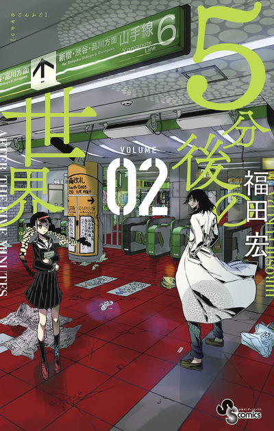
I really like how 5 minutes covers look like scenes cut straight out of the manga itself, and Fukuda's use of....I'm not sure what that's called. A gradient? It's what's on Kakeru's hair and Jiro's coat. Also the series title being both in English and Japanese (and with that font) really gives off an aura of how dire things are in the series proper. I also like the volume two being front and center here despite normally not being a fan of the volume number being so huge. I suppose it being in the middle where it's not obscuring anything else works a lot for it. The colors also compliment the scene well, so I think this one gets cover of the month!

Well....I guess I can't be upset for Matsuena doing what he does best, even if it looks odd...maybe even a little painful. Though that's how he goes. I get too that the main draw is going to be Ayame in a shounen magazine but she's now appeared on more covers than the protagonist which is weird to me for a series that isn't like say, Gintama in Jump where a different character appears on each cover. Especially since there are many characters in 008 that would have been much more interesting to see. Otherwise I still dig the logo and how small the volume # is.

Speaking of different characters per cover, Daiku goes with someone new on it's sixth volume, and I like how the colors of his outfit stand out against the greyscale background as well as Kusaba's name being in red as well. It's kind of a warm and aesthetically pleasing cover. I hesitate to call it "comfortable" but there's something inviting about it.

There's just so much activity on volume 9 of Maoujo and I like it a lot! Although the weird panel thing that often comes with the series title is still there, it's a lot less distracting this time around. I also like the princess being front and cover as well as her expression. It might just be me but I feel like we only recently had this story in the manga? Considering how short the Maoujo chapters are I'm just surprised to get it on the cover of a volume so soon. Though yes, there's a lot of energy here and I really like it.

Megumi is pretty. Oh, I mean the cover and the character. Nekoguchi's use of color and perspective is really great here --the blurred effect on the flowers as they get closer to the audience really makes one feel like they're actually in the scene. Megumi's expression helps that perspective too, I think. I like the positioning of the logo as well --it's present but not distracting, possibly because the color of it blends in with the flowers. Ah, if I could have two covers of the month I'd pick this one, but Five Minutes just leaves more of an impression on me. Still Megumi is pretty --and I mean it enough to say it twice!

Man, talking about Major after it's hiatus announcement last week seems like faux pas, but a volume released this month so I have to talk about it. Really there's not much to say --the covers are very uniform, and this one especially doesn't really stand out much. That's not necessarily a bad thing since if you're 16 volumes in then you should already know what you're getting into. I do think (as always) that the colors mesh well together and I enjoy Mitsuda's character designs. Hopefully he returns sooner rather than later (not too soon of course.) For now though I hope volume sixteen will whet the appetites of Major fans.

Like Major before it, Be Blues is pretty straight forward though again with as many volumes as it has readers are probably in it for the long haul. Maybe that's just how things are, but it really does feel like at least for sports series that simple is best for the covers and the real artwork shows up in the volume itself. Not to say that this isn't well drawn, but it definitely belies just how awesome Tanaka's art is, and that's a bit of a shame even if I get why he might want to keep the volume covers as simple as possible.
And that's it for covers this month! What are you thinking of picking up? If you have a moment, let me know in the comments! Of course I (hope) to have the features edition for issue #53 out today as well so stay tuned!
Comments
Post a Comment